
Institutions spend millions on flagship research — competitiveness reviews, demographic studies, evaluations that set the agenda for a political cycle or a generational one. The analysis is world-class. Then nearly all of it is read the same way: a long PDF is skimmed by a handful of specialists, quoted in a few op-eds, and filed away. The findings stay true; they just stop being read, used and communicated.
We convert reports into instruments: apps where a policymaker, journalist, or citizen can explore the evidence themselves instead of trusting a summary. Commission the analysis once; make it legible forever.
The challenge
A report describes a moment, in the shape of a document: hundreds of pages, organized by chapter, fixed on the day it is published. The reader who needs a particular country's numbers or wants to know what's changed since publication has nowhere to go. So the evidence that cost millions to produce reaches a fraction of the people it was meant for and ages the moment it's printed.
When the public doesn't understand the policy, fake news and propaganda flourish. Expert research should also have a strong communication layer.
The static, hard-to-read format of reports is the problem that we fix.
What we built
A repeatable conversion from report to app. The method is the same whatever the source:
- Structure — the report's findings become structured, sourced data, not prose.
- Interface — an app organized around the reader's questions, not the document's chapters: mobile, searchable, built for real use.
- Longevity — automated data pipelines keep it current and a scorecard keeps it accountable, so it keeps working long after the launch event.
The result reaches audiences the PDF never will. Two live examples:
Example 1 — The Draghi Report Tracker
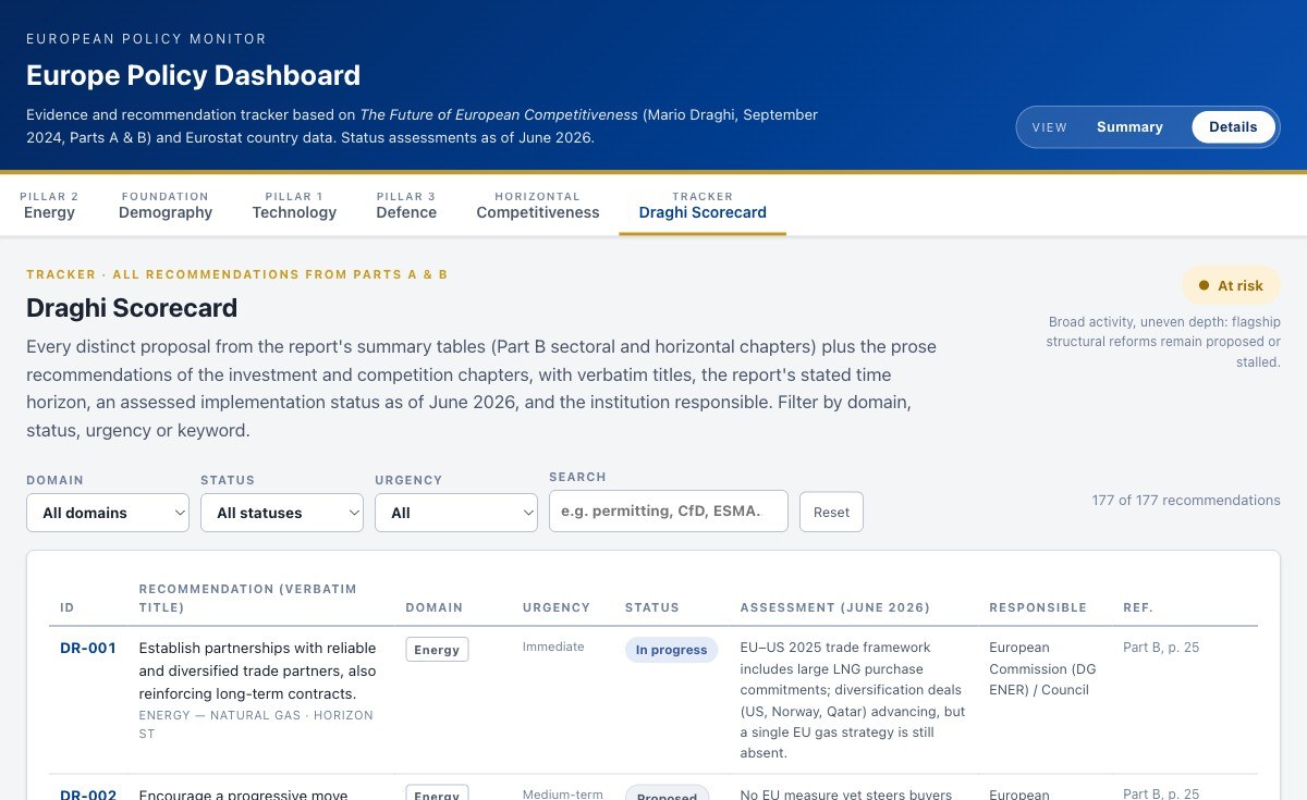
The Draghi report on EU competitiveness runs to hundreds of pages — energy, technology, defence, skills, dozens of dependencies and recommendations that set the agenda for a whole generation. We rebuilt it as a policy dashboard:
- Thematic sections — Energy, Demography & Skills, Technology & Innovation, Defence & Space and more — each opening with why it matters, in plain language.
- A tracking scorecard: 18 headline proposals and 177 indicators, so the question shifts from what did Draghi say? to what has happened since?
- Country comparisons on live Eurostat data, named strategic dependencies, and the recommendations linked to the evidence behind them.
- Built for real use: mobile, dark mode, printable briefings.
A report describes a moment; a tracker keeps score. That difference is what turns last year's landmark study into this year's accountability tool.
Example 2 — Demography of Europe
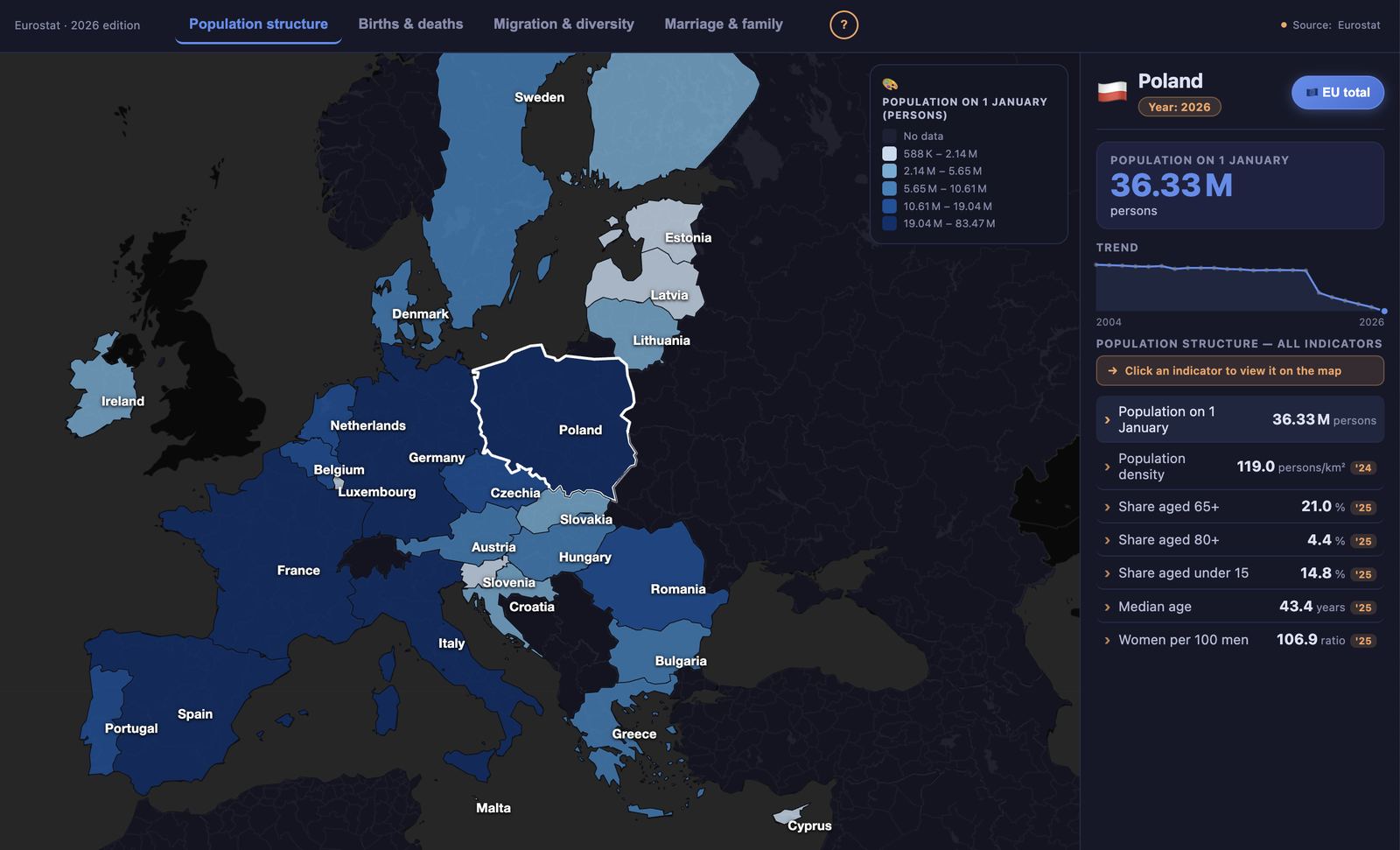
Eurostat's Demography of Europe – 2026 edition is genuinely extraordinary work: population structure, ageing, migration, marriage, fertility, life expectancy, all rigorously sourced and clearly explained, country by country, year after year. Few statistical offices anywhere produce something this thorough and this well-written. It deserves more readers than the format it's published in tends to reach.
That's because the report spreads its work across dozens of chapters, each with its own separately embedded chart — a scroll and a click at a time. We built an explorable atlas that puts every one of those trajectories on a single screen: an automated pipeline pulls the same Eurostat data, and one interactive map lets anyone compare countries and trace decades of population change without leaving the page.
Because the pipeline is automated, the app doesn't age the way a report does. When the data updates, so does the story.
Who this is for
Institutions that fund serious research and want it to reach millions of citizens: EU institutions and agencies, international organisations, think tanks, national ministries. If your last flagship report deserved more readers than it got, this service line exists for you.
Have a report too dense for the general public?