
Every country runs on a handful of core systems — health, education, transport, social care — and each one throws off enormous amounts of performance data. Hospitals report activity, beds, staffing and budgets; schools report enrolment, results and spending; transport networks report traffic, punctuality and cost.
The challenge
The evidence a system needs to steer itself already exists.
But it lives where all government data lives: massive datasets, complicated spreadsheets and filing returns that a handful of specialists can read and no one can compare across institutions. So the data sits there, and the questions that matter go unanswered.
We turn that raw reporting into a single live dashboard: every institution on one screen, comparable against its peers, its region, and the national picture. The same tool the administrators use to steer the system is published for citizens to inspect, hosted on the institution's own infrastructure.
What we built
A live dashboard the institution runs continuously on its own infrastructure. The shape is the same across systems:
- Every unit on one screen, comparable against its peers, its region, and the national picture, with a map view.
- The indicators its users actually think in — activity, capacity, staffing, quality, and full financials — not the layout of the filing form.
- A decision tool and a public asset in one. Administrators benchmark and steer; citizens and journalists inspect the same evidence, not a press-release summary of it.
- No training required. If you can use a website, you can use it.
The example — Romania's public hospitals
We built this first for CNAS, Romania's national health insurer, covering all 372 public hospitals across 42 counties. The Ministry of Health's data set is rich — case volumes, case-mix complexity, length of stay against national norms, occupancy by care type, beds, staffing, and full financials, contracted versus realized versus paid — and, in its current format, unusable. We turned it into a dashboard organized the way its users think.
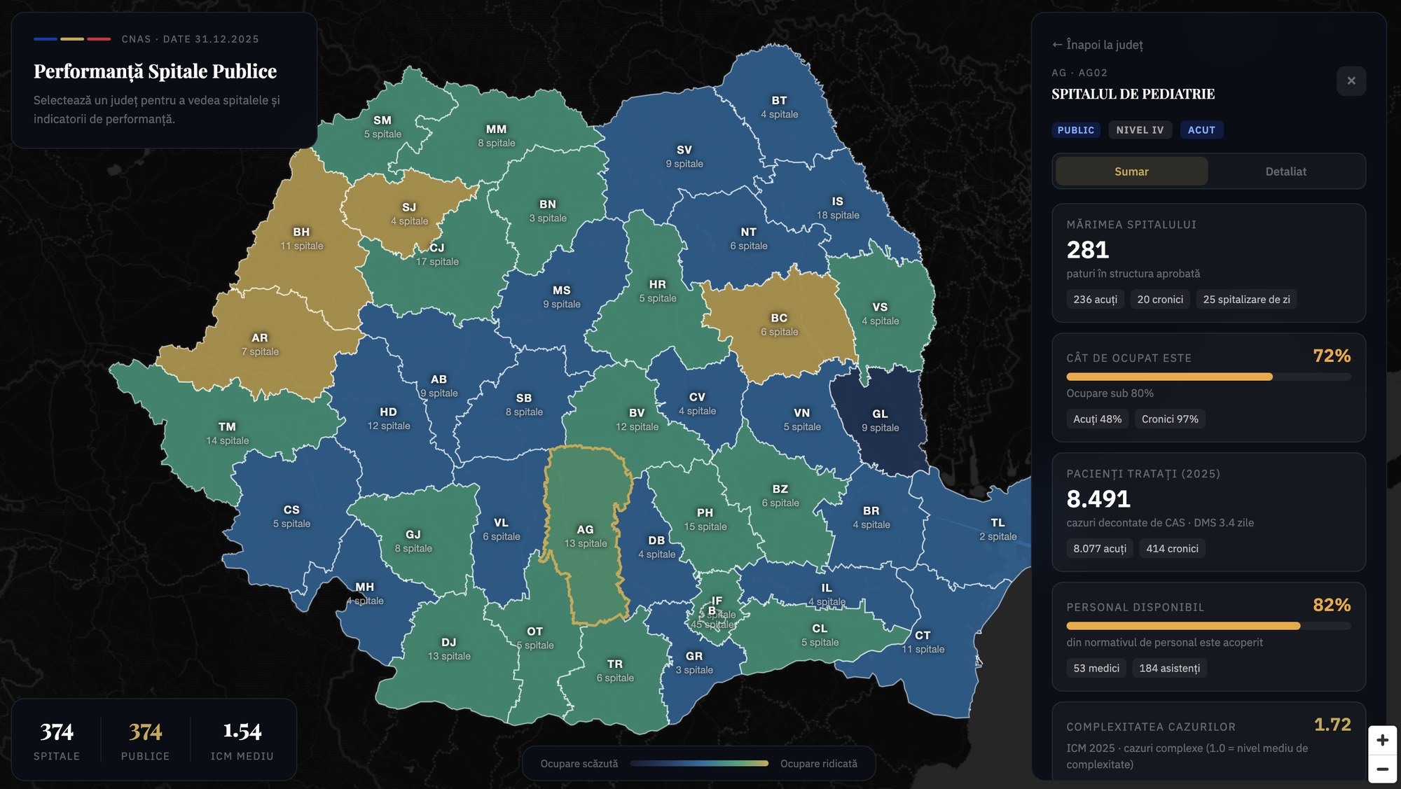
Behind every hospital sits its full profile: classification (competence level, bed profile, subordination); clinical activity (cases, case-mix index, length of stay against norms, occupancy across acute, chronic and long-term care); capacity and personnel; and financials (service values, personnel cost shares, contracted vs. realized vs. paid). Each one comparable against its peers, its county, and the national picture.
A decision tool. Staff in 372 public hospitals and 42 county-level insurance houses use it to benchmark performance, spot anomalies, and ground contract discussions in shared numbers.
A public asset. Citizens and journalists inspect the same evidence the administrators see. Not a press-release summary of the data — the data. Transparency isn't a separate deliverable; it ships with the tool.
Running a national system whose performance is not legible?